DFT/FFT in theroy and with Python
Theory
I wrote an article about DFT and FFT some time ago. You can view it inside your browser by clicking the link below. Currrently it’s only available in german. Please excuse this.
Python
The knowledge gained from the article can be used, to do something (actually not so) usefull. But you’ll get the idea ;-).
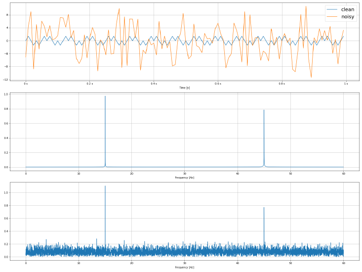
The script below will create two different sine functions. One with and one without additive noise.
The noisy signal is quite noisy. So noisy, that you can’t identify it’s origin in the time domain. But the FFT reveals it!

import numpy as np
import matplotlib.pyplot as plt
import matplotlib.ticker as tck
from scipy.fft import fft, fftfreq

# Time period of the samples
# As the article describes:
# A high sample rate means a low frequency resolution.
# But we have to fulfill the Shannon-Nyquist theorem!
f_max = 60 # in Hz
T = 1/(2 * f_max)

# Signal length [s]
# You'll need a long time interval for a good resolution in freequency domain!
# Try reducing the signal length ;-)
sl = 100 # Seconds

# Total number of samples
N = int(sl / T)

# Time axis values
t = np.linspace(0, sl, N)

# Signals in time domain with and wihtout noise
s0 = 2*np.sin(2*np.pi*15*t) * np.sin(2*np.pi*30*t)
noise = np.random.normal(0,5,N)
s1 = 2*np.sin(2*np.pi*15*t) * np.sin(2*np.pi*30*t) + noise

# Frequency spectra (FFT / DFT)
sf0 = fft(s0)
sf1 = fft(s1)

# Scale them correctly!
sf0 /= N
sf1 /= N

# Frequency axis values
xf = fftfreq(sf0.size, T)

fig, ax = plt.subplots(3, 1, figsize=(20,15))

ax[0].set_xlabel('Time $[s]$ ')
ax[0].xaxis.set_major_formatter(tck.FormatStrFormatter('%g s'))
ax[0].yaxis.set_major_locator(tck.MultipleLocator(base=4))
# Plotting only the first second (visually nicer)
ax[0].plot(t[:int(1/T)], s0[:int(1/T)], label='clean')
ax[0].plot(t[:int(1/T)], s1[:int(1/T)], label='noisy')
ax[0].legend( prop={"size":20})
ax[0].grid()

ax[1].set_xlabel('Frequency $[Hz]$')
# Plotting only the upper half of the freq-domain
# Be careful with the y-axis scaling!
ax[1].plot(xf[:N//2], np.abs(sf0[:N//2]))
ax[1].grid()

ax[2].set_xlabel('Frequency $[Hz]$')
# Plotting only the upper half of the freq-domain
# Be careful with the y-axis scaling!
ax[2].plot(xf[:N//2], np.abs(sf1[:N//2]))
ax[2].grid()

fig.tight_layout()
fig.savefig('time_vs_frequency.png')